
Digitalorganics.com.au
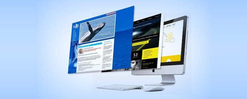
We provide a Service to turn your current Website into a mobile responsive site, for mobile smartphones, iPad, iphone, tablets and other small screens.
More and more people and now using mobile devices to access information through internet. With the rise of smartphones, androids, tablets and other internet devices, people on the go choose to rely on these gadgets to get information, access emails and get in touch through social media.
It is advisable to create mobile friendly websites for the benefit of people who use mobile phones and for online marketers to reach prospective customers and clients even when they are constantly traveling.
What you need to know about mobile website design:
- Why it’s so vital to cater to mobile web users and why this is going to be even more important in the future.
- The five main areas that you need to focus on no matter what type of business you are in.
- Tools you can use to build a mobile friendly site and ways to optimize your existing site.
- The best way to prepare your digital media for mobile consumption which includes formatting videos and ebooks.
The Rise of Mobile Devices
Since 2007, the rise of mobile web users has been consistently increasing each year and it is estimated that by the year 2014 mobile web users will overtake desktop web users.
What do you need to do as a mobile marketer?
You need to review every aspect of your marketing to ensure that it is mobile friendly. Second, you should know the demographics of your target market so you’ll know what percentage of them use mobile. There is a huge probability that majority of them already use mobile so it is important for you to make your sites mobile friendly.
Email Marketing for Mobile Devices
Emails are already accessible through mobile phones and a lot of people are already using this application. So how can you use email marketing for mobile?
- Make sure your messages are short, well formatted and easy to read.
- Make sure to place your link in the very first paragraph. So that your readers can easily get to your website without having to look for link down to the bottom of your message.
- Mobile highlights the “From” so you want make it more personalized. Make sure it’s from a name of a person representing your brand, not the name of your company.
- Create short subject lines with catching titles to get people interested in opening them.
- Use plain text messages. Not all are using smartphones so html messages may not be read on some phones.
Evaluate your Mobile Website
How does your current website stand from the eyes of a mobile user? Consider how many visitors you might be alienating and the amount of money you could be losing. Do your visitors get what they are looking for in your website?
Mobilizer is one great tool you can use for email marketing. You can easily download and install it and it could change the way you look from the perspective of a mobile user. A lot of websites are not mobile friendly. Users can only a small visible portion from the page and some of the important links may not be visible as well.
Here are some great tips to make your website to appeal to mobile users:
- Make sure that your website is mobile friendly!
- Think about building a separate mobile website.
- Flash won’t display on any Apple device so you don’t want to use it.
- Minimize scripts, pop-ups and lightboxes.
- Check how your website looks on multiple mobile devices.
How to Design your Mobile Website
Here are some things to remember when building a mobile friendly site:
- It is important that you eliminate unnecessary content that is irrelevant to mobile users.
- People who use mobile travel and are constantly moving from one place to another and are most of the time in public places.
- Mobile users have limited time. They need information right away.
- Your texts must be short and straightforward.
- It is necessary to advice visitors to use desktop version of your website in case they need a more detailed presentation.
- Ads within the site consume bandwidth and slow down your site. So you don’t to put ads on your mobile website.
Screen Resolution
Different devices have different screen resolutions. So when designing a website, you have to:
- Make a design for a smaller screen resolution.
- Make sure that whatever design you make, it’s going to look good on almost any type of mobile device such as iPhone, iPad, Blackberry and other Android phones.
- Big resolution images take too long to load. They just waste screen space and time as well.
When building a mobile site:
- Install a code to detect to detect if a user is on a mobile device.
- Buy a mobile domain name for your site.
- Use a subdomain on your site.
- Use an online site builder.
Mobile Web Builders
Digitalorganics.com.au
We provide a Service to turn your current Website into a mobile responsive site, for mobile smartphones, iPad, iphone, tablets and other small screens.
Mobile Web Site Design Considerations
Keep your layout simple – this is one of the most important things that you have to keep in mind when creating a mobile website.
Identify visitors and intentions – it is necessary that you identify the needs of people who will be visiting your website. Know their intentions and offer ready information. Lay your schedules, map, and contact details.
Single call to action on each page – keep it simple. Offer one thing that they got to do on each page because mobile people don’t have all the time to follow multiple directions at once.
Blogging for Mobile Devices
Here is a list of publishing sites that you can use for mobile publishing and blogging
- Mobile Press
- Onswipe – this is applicable for swipes and iPads to make them friendlier on a very nice swipe effect. This also helps convert your website into a swipe-able website.
- WordPress Mobile Pack
Image Galleries
oQey Gallery – You can use oQey gallery to ensure that your image galleries work on mobile.
Integrating Mobile with your current Marketing
- Include mobile in your marketing process.
- It is important that you capture email address and gather phone numbers to build a mobile list.
- Send voice or text messages. Remember that mobile has 95% open rate.
- Having a mobile list can increase your engagement with people, attendance on webinars and can also increase your conversions.
/ul>
Mobile Text and Voice Messaging
Voice Shot – this application can help increase attendance on webinars and increase the number of purchases on certain promotional products.
Mobile List Buliding
Trumpia – a great mobile list building device you can use.
Digital Media for Mobile
There are a lot of videos that are not playable on certain mobile devices. That is one problem most mobile website owners encounter. So here are some of the things to do:
- Make sure that your videos are playable on all mobile devices.
- Make sure that the aspect ratio is friendly to mobile. The ideal size to use is 640×360 for the aspect size of 16:9 or 640×480 for the aspect ratio of 4:3.
How to Export a Video
The codex to use when exporting a video is h264.mp4. This can be played on almost all mobile devices.
- Keep your files small. Remember that mobile bandwidth is limited and is expensive.
- Use online video service such as Youtube which easily converts videos to formats that are mobile friendly.
Digital Documents
Make sure your documents can be easily downloaded and read on almost any mobile device. .epub and .pdf formats are ideal formats to use for documents. Consider publishing in Amazon Kindle so people can read your ebooks.
PDF for Mobile
To be certain that your PDF is readable on most mobile devices, make sure to encode them in Adobe Reader X for Mobile. This will guarantee that your PDF files are readable and available on mobile devices.
Mobile Links
To create mobile links:
- Use QR codes on all your marketing materials. This allows mobile users to access your website from their phones almost instantly.
- Use QR codes for email capture to send people directly to your mobile squeeze page.
What you can do now:
- You can now start reviewing your current marketing and heck ho mobile friendly it is.
- Build your mobile site or simply convert your existing site to a mobile friendly one.
- Format your digital media to make them mobile friendly. Convert all your existing media to mobile friendly formats. And for all media files that you will be uploading, make sure to convert them into mobile friendly formats.


